USER INTERFACE AND USER EXPERIENCE DESIGN WORK

Store Redesign on
World of Tanks:
Modern Armor
I drafted, designed, and prototyped a redesign of the Store for World of Tanks: Console (now World of Tanks: Modern Armor), from UX graybox mockups, to fully working controller prototype, to its final designed state today.

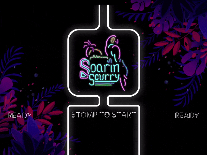
SOARIN’ SCURRY
This game’s interface and visual language were entirely recreated from scratch between the period of October - January 2019, for the Indie Arcade at MAGFest. The game’s initial visual design was grass-themed, bright, and goofy, with a UI that wasn’t quite cohesive with its visual identity. This game called for special consideration for user interaction, as players strapped on and stepped onto custom controllers made just for the game. Menus are navigated by flapping arms and stomping feet.
ABOUT SOARIN’ SCURRY
Soarin' Scurry is a two-player racing game where you get to use your body as a controller. (View MAGFest participant footage here.) Step onto your bright neon Bird Pad and don your Wing Connectors to get into action. Frantically stomp your feet and flap your arms to make your way across lush, vibrant neon levels which will truly test your avian abilities. Land your bird on the Finish Square first for victory (and bragging rights)! This game is the first of many games to come from the collective Dolphin Dungeon.
(Above: Navigating instructions screen, 1.5x speed)
TEACHING A GAME, FAST
Showing our game at a convention meant our instructions had to be clear, concise, and digestible for two players all in the span of a few minutes in order to keep our play cycle running smoothly. Because of this, I thought the best way was to break our start screen, instructions, level select, and bumper selection into separate screens so as to not overwhelm the player.


FLASHY BUT FUNCTIONAL
The game’s UI elements as well as handling of visual flair are over-the-top, vibrant, and energetic, just like the neon signs our visual language pulls from, This treatment aimed to get players amped-up about competition. Simple instructions for what to do on each terrain element flash when they change between RUN and FLY modes, and fill up depending on the player’s momentum level.
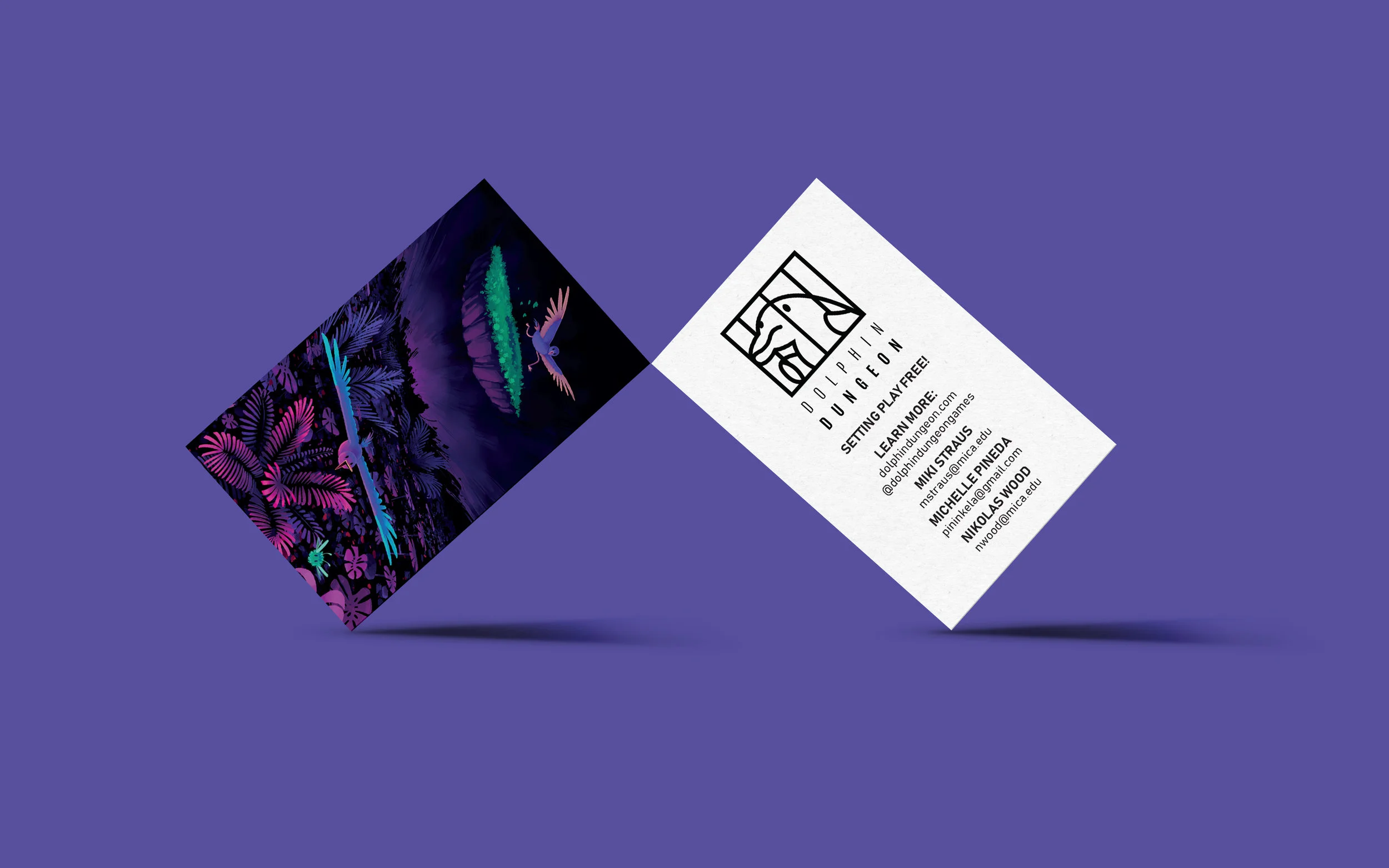
SUPPLEMENTAL DESIGNS
In addition to working on the user interface and development for Soarin’ Scurry, I also worked with my team to design our supplemental promotional materials. This included our game’s logo (above), collective’s logo, business card design, takeaway sticker design (all below), and MAGFest promotional images both physical and digital.


make.it
make.it is a fictional company focused on connecting artists of all disciplines with game developers and designers. For this project, I created an app design, website design, and print materials promoting the connection of creators.

Pictured: an animated example of a user’s experience in-app
A FOCUS ON COMMUNITY - BY DESIGN
For the interface present on both the mobile and desktop side of this service, I put a particular emphasis on discovery of content, teams, and talented individuals, as well as on messaging and communication between members. These focuses make up the most prominent aspects of the website. make.it aims to create a collaborative community through these focuses.


To view the desktop experience in motion, click here

PRIME-TIME CRIME
Multiplayer has always been a fascination of mine, but this game tested my limits on how to convey rapid real-time number-based stats on each player’s standing as they beat each other up and gathered coins. Four players = lots of chaos and lots of numbers.
ABOUT PRIME-TIME CRIME
Prime-Time Crime is a four-player competitive multiplayer game where you loot a bank, the city, the sewers, and the park for all of the money you can carry. Take on the role of HELGA the Strong, OL' BETTY the Wise, GARY the Guy, or TONY the Tough Guy and duke it out across the city on your way towards the Getaway Car.


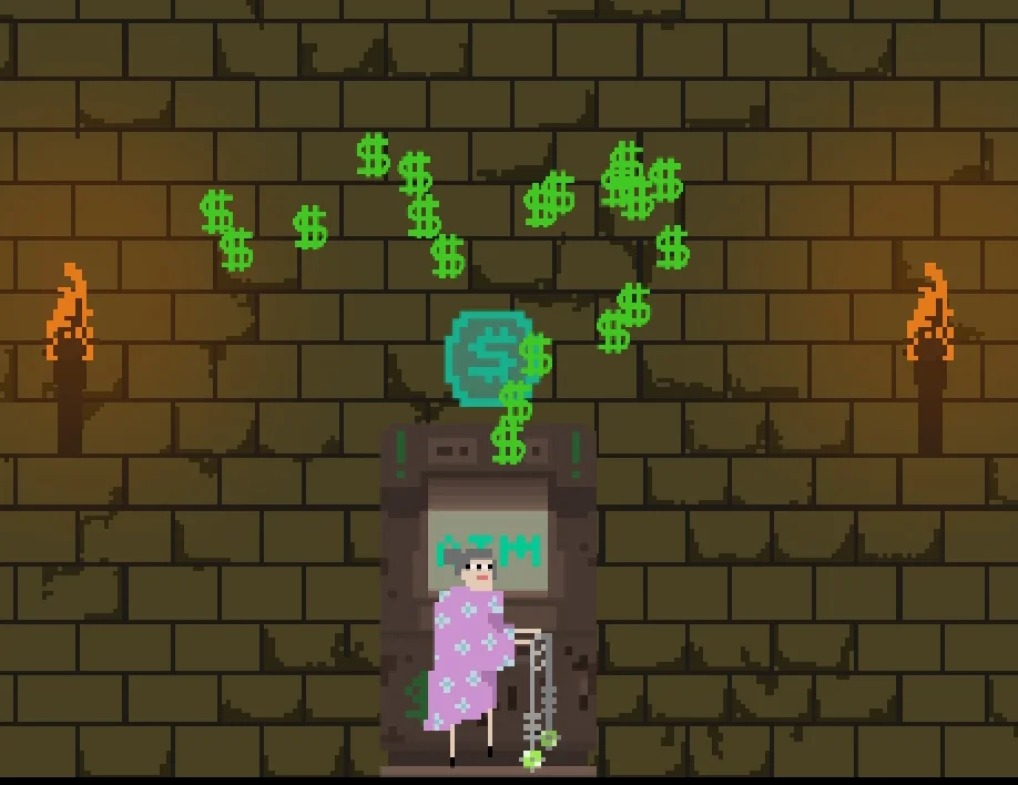
Pictured: feedback for depositing money into the ATM
IMPORTANT IN-WORLD CUES
In addition to keeping track of the overall stats and ranking of each player, a big focus of this project was attempting to show valuable information right in the middle of the action. Each coin collected and chunk of coins lost are shown directly in the game space (both with physical coins and floating point numbers) in order to keep players focused on the action, When a user is gathering or losing a lot of money, the feeling is visceral through coins flying or dollar signs generating. This separation of stat communication allows immediate feedback for small gains and losses in the world-space, while still leaving total stats present in the ID Card Tray. I made these shapes reminiscent of licenses to reinforce the idea of the players’ successes and failures being part of their character’s worth as a robber.
THANK YOU FOR VIEWING MY WORK! ♥